Timeless pieces. No logos. No noise.

The Quiet Luxury Color Palette: Why These Tones Never Date
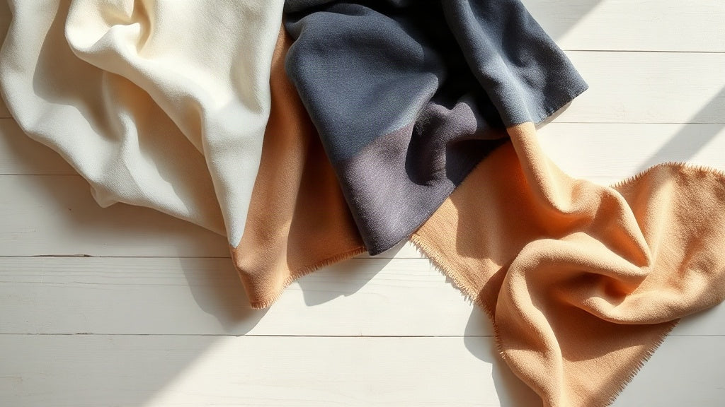
A quiet luxury color palette relies on cream, ivory, camel, taupe, navy, charcoal, and soft black. These desaturated, warm tones layer effortlessly and age gracefully, forming the foundation of timeless wardrobes that work across seasons and decades.
In this article10 sections
- The Core Foundation: Cream, Ivory, and Off-White Tones
- The Warm Earth Anchor: Camel, Taupe, and Soft Brown
- The Cool Ballast: Navy, Charcoal, and Soft Black
- The Restraint Accent: Olive, Burgundy, and Their Place
- Why These Colors Layer Without Effort
- The Mathematics of Restraint
- Seasonal Shifts Within the Palette
- The Age Factor: Why These Colors Improve
- Building a Palette From Zero
- FAQ
A quiet luxury color palette doesn’t announce itself. It lives in a narrow band of tones that layer without clashing, age without fading, and look equally refined at thirty as they do at fifty. This isn’t the vibrant edge of fashion magazines. It’s the restraint of someone whose closet was built over decades, not seasons.
The philosophy holds: color should serve the wearer, not the other way around. A cream linen shirt works with charcoal trousers, navy knitwear, and a camel coat. Taupe and ivory shift seamlessly from morning to evening. Olive and burgundy arrive as gentle accents, never as demands. This is the grammar of old money dressing, where the palette itself becomes invisible because it works so reliably.
The Core Foundation: Cream, Ivory, and Off-White Tones
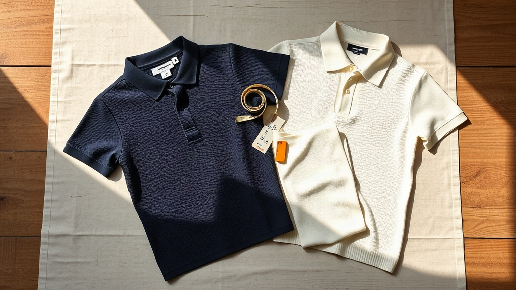
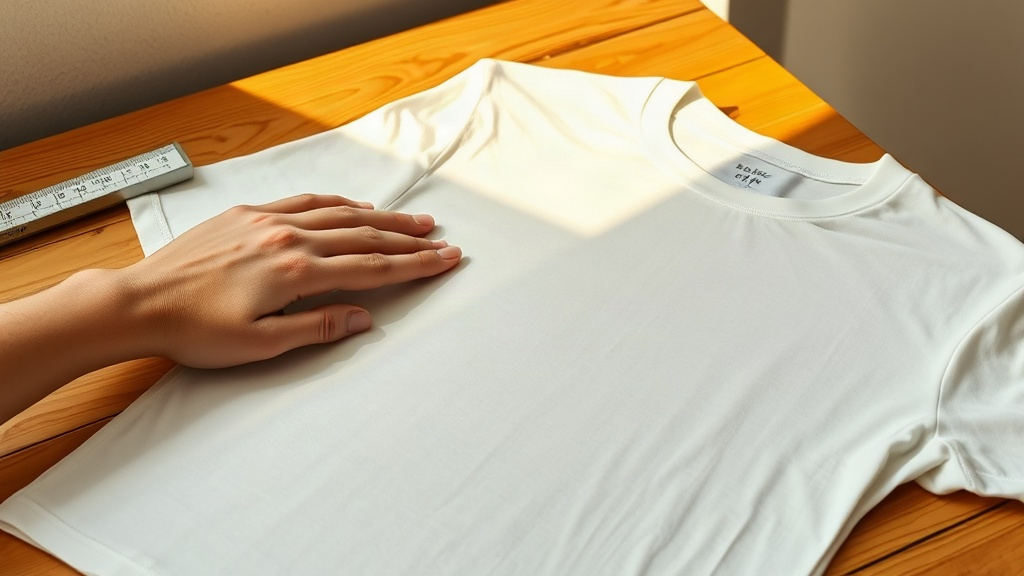
The palette begins with what appears simple but demands precision: white in all its variations. Not bright white. Not the blue-white of a fresh shirt fresh from the packet. Instead, cream, ivory, and aged whites that carry warmth. These are the tones of linen that’s been worn and washed, of wool that’s lived in a closet for years, of materials that have absorbed light rather than rejected it.
Cream differs from ivory in ways that are subtle but visible in natural light, yet they layer together without friction. A cream linen shirt under an ivory sweater reads as intentional calm rather than color confusion. The eye accepts them as a single, soft continuum. This is what old money dressing teaches: tones need not match to harmonize.

These neutrals form the true working base of the wardrobe. A cream blazer, ivory trousers, and an off-white linen shirt together represent dozens of outfit combinations across seasons. Because they’re so neutral, they become the canvas. The eye moves to fabric, to drape, to the person wearing the clothes, not to the color itself. That’s the whole point.
The Warm Earth Anchor: Camel, Taupe, and Soft Brown
Where the palette gains warmth, it does so gradually. Camel, taupe, and soft brown exist in the middle register, and they are perhaps the most versatile colors in the quiet luxury color palette lexicon. A camel coat remains one of the few single pieces that genuinely works with nearly every other color in this palette, across every season and every decade since it was established as a classic.
Taupe sits between gray and brown, warm but not orange, earthy but not heavy. It’s the tone of stone in certain lights, of wool that’s aged for years, of suede that’s been lived in. Taupe trousers wear with navy, cream, olive, burgundy, and charcoal without requiring thought. It’s the anti-statement color, which is precisely why it has so much power.
Soft brown and tan occupy similar territory. Where camel is aristocratic and measured, soft brown feels closer to earth, yet still refined. The distinction matters when building a capsule wardrobe. A camel overcoat, a taupe sweater, and soft brown loafers create a progression that feels inevitable rather than coordinated.

These warm neutrals do something the paler tones cannot: they anchor the entire palette. Introduce burgundy or olive, and it’s the camel or taupe that makes those colors feel restrained rather than bold. Without this warmth in the foundation, the palette can tip toward coldness. With it, every piece seems like it was made to exist alongside every other piece.
The Cool Ballast: Navy, Charcoal, and Soft Black
Deep tones ground the palette. Navy and charcoal serve as the quiet anchors that make everything else possible. They’re dark enough to feel structured, formal enough for professional contexts, yet restrained enough that they never feel harsh or trendy. A navy blazer, charcoal trousers, and navy knitwear read as the foundation of a serious wardrobe, not as a statement.
The distinction between navy and charcoal is subtle but crucial. Navy carries a hint of warmth, a marine undertone that prevents it from feeling cold. Charcoal sits between gray and true black, softer than black but darker than pure gray. Together, they offer options for those who need dark pieces but want to avoid the potential severity of pure black.
Soft black deserves its own category. It’s not the black of graphic design, not the black of tuxedos, but rather the black of wool that’s been worn, of tailoring that’s settled with age, of materials that have absorbed light over years of use. A soft black sweater or tailored overcoat feels different from bright black. It feels lived-in before you wear it. This matters more than it seems.
The Restraint Accent: Olive, Burgundy, and Their Place
A palette built entirely on cream, taupe, navy, and charcoal can feel austere. Olive and burgundy arrive as the exceptions, the colors that prove the rule. They appear not to dominate but to punctuate. An olive linen shirt worn with cream trousers and a camel jacket reads as intentional but not loud. A burgundy knit under charcoal tailoring feels like a deliberate choice, not an accident of enthusiasm.
These colors work precisely because they’re used sparingly and in forms that respect the overall restraint. Olive as a full sweater, burgundy as a single knitwear piece, never both in one outfit, never both in bright saturation. The muted versions of these colors, the ones that sit in the dusty, desaturated register, integrate with the palette rather than interrupt it.
This is the structural principle of old money color: there is no color used carelessly. When something steps outside the primary range, it must earn that presence through its subtlety and through the care with which it’s introduced. A burgundy cashmere polo worn alone, with cream or taupe, reads as sophisticated. The same polo worn with an olive sweater reads as confusion.
| Color Family | Primary Tones | Best Role in Wardrobe |
|---|---|---|
| Pale Neutrals | Cream, ivory, off-white | The canvas. Shirts, knitwear, light layers that work with everything. |
| Warm Foundation | Camel, taupe, soft brown | The anchor. Outerwear, tailored pieces, mid-layer essentials. |
| Deep Tones | Navy, charcoal, soft black | The ballast. Tailoring, outerwear, structured pieces that ground. |
| Muted Accents | Olive, burgundy (desaturated) | The exception. Used alone, never in combination, always restrained. |
Why These Colors Layer Without Effort
The real power of this palette reveals itself in the layering. Cream under taupe under camel works not because these colors “match” in any traditional sense, but because they share an underlying philosophy. They’re all desaturated. They all sit in the warm to warm-neutral register. They all have a quality of age to them, even when new. When colors that share this character are layered, the eye accepts the combination as inevitable.
Contrast this with fashion advice that focuses on complementary colors or saturation levels. Those systems produce logical combinations that often feel cold or overly constructed. The quiet luxury color palette approach produces combinations that feel inherited, as though the wardrobe assembled itself over time rather than being designed all at once.
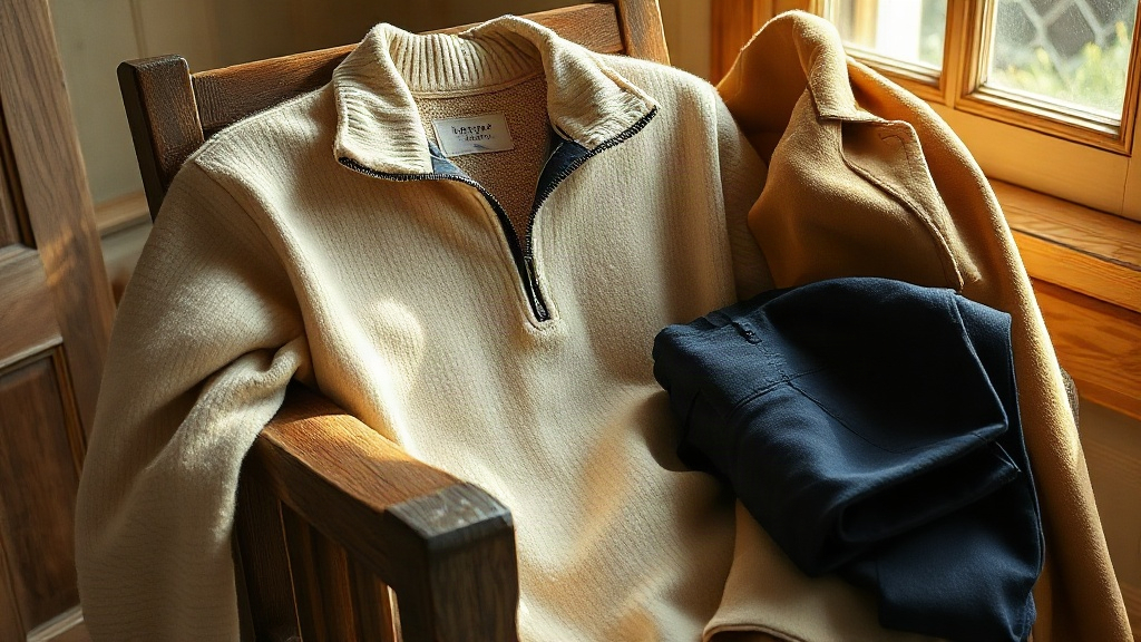
This is why a cream sweater, taupe trousers, and a camel coat worn together feel effortless. They’re not “coordinated.” They’re consonant. Each tone sits comfortably alongside the others because they share a tonal family and a degree of saturation. Someone observing you might not notice the colors at all, which is precisely the intended effect.
The Mathematics of Restraint
Old money color theory relies on a simple principle: fewer dominant colors, more layers of the same colors. A wardrobe built on cream, camel, navy, and taupe repeated across different fabrics and silhouettes offers far more versatility than a wardrobe with twelve different colors, each appearing once or twice. The repetition isn’t boring. It’s elegant. Each piece gains resonance from the presence of the same tone elsewhere in the outfit and in the wardrobe overall.
This is the opposite of trend-driven dressing, where novelty and variation drive the narrative. A taupe sweater is not novel. Navy trousers are not novel. But when these pieces exist alongside each other in a cohesive palette, when they can be mixed and matched across seasons and contexts without requiring conscious thought, they become far more valuable than pieces that exist in isolation.
The mathematics is also practical. A small wardrobe in a restrained palette functions like a wardrobe twice its size. Five sweaters in cream, camel, and taupe layered with five pairs of trousers in navy, charcoal, and taupe produce dozens of viable combinations. Five sweaters in five different colors layered with five pairs of trousers in five different colors produce outfit combinations that often feel wrong. One arrangement cannot be explained through fashion logic alone. The other cannot be explained through anything but restraint.
Navy trousers sit at the center of this arithmetic. In a palette of cream knitwear, camel outerwear, and taupe accents, a well-cut pair of navy trousers becomes the hinge on which the entire wardrobe pivots, working across seasons and formality levels without requiring replacement.
Seasonal Shifts Within the Palette
One of the remarkable properties of a restrained color palette is that it doesn’t require seasonal overhaul. Spring doesn’t demand pastels. Summer doesn’t require brightness. Autumn doesn’t necessitate oranges. Instead, the same palette persists through the year, but the fabrics and weights shift. A cream linen shirt in summer and a cream merino knit in winter are both cream, but the material weight and texture allow the wardrobe to feel seasonally appropriate without requiring color revision.
Taupe in wool for autumn and taupe in linen for spring read as the same foundational tone but with entirely different seasonal implications. A navy wool blazer in winter and a navy linen shirt in summer maintain continuity. The eye accepts this repetition because the fabric itself signals the shift. This is efficiency masquerading as restraint.
Olive and burgundy, those accents mentioned earlier, can shift in weight and saturation slightly by season, but the fundamental palette remains unchanged. Restraint in color selection actually permits greater freedom in fabric exploration, because the material itself carries the seasonal narrative rather than the color.
The Age Factor: Why These Colors Improve
Colors in this palette share a particular property: they age gracefully. A cream linen shirt worn repeatedly and washed frequently becomes softer, warmer. The color doesn’t fade in the way bright colors do. It settles. Navy wool deepens and becomes richer. Taupe develops character through use. These aren’t colors that look dated after five years. They look lived-in, which is a different and preferable quality entirely.
This happens because these tones are already desaturated, already soft. They have nowhere to go but deeper into their own character. A bright color fades toward gray. A desaturated color deepens toward richness. The difference is profound over a decade of wearing.
This is why old money families pass down pieces. A charcoal wool coat worn in 1980 and again in 2026 reads as appropriate to each era because the color itself doesn’t carry era information. It simply persists, becoming more refined with age. The quiet luxury color palette doesn’t trap the wearer in a moment. It frees them from moments entirely.
The charcoal wool V-neck is a precise illustration of this principle. In a fine-gauge wool, it ages the way a good piece of tailoring ages: neither ostentatiously nor badly, but quietly and well.
Building a Palette From Zero
For someone starting from scratch, the approach is methodical rather than emotional. Begin with the neutrals. A cream or ivory shirt, a pair of navy or charcoal trousers, a camel or taupe layer. These three pieces form the foundation. Everything else in the wardrobe, for years to come, should harmonize with this base. It’s not restrictive. It’s clarifying.
The next phase adds depth through repetition. A second navy piece, a second camel piece, a second cream piece. Not variation, but redundancy. Each piece should work with everything else already owned. This sounds limiting until one realizes that five pieces in a restrained palette produce more viable combinations than fifteen pieces in chaotic colors.
Only after this foundation is solid does one consider olive, burgundy, or other tonal variations. And even then, the rule remains: these colors appear as accents, single pieces, never as dominant tones in the wardrobe. An entire outfit in burgundy reads as a statement. Burgundy as a single sweater under navy tailoring reads as taste.
The building process takes time. That’s the point. A restrained palette developed over years, one piece at a time, with intention and consideration, becomes a wardrobe that works. A chaotic palette assembled quickly becomes a closet that fails. The difference is patience and restraint, two qualities that old money dressing has always required and always will.
Key takeaways
- Build from neutrals outward: cream, navy, and camel first, accents last.
- Repetition of tone across fabrics creates versatility, not monotony.
- Olive and burgundy earn their presence only when introduced as single, muted pieces.
- Fabric weight carries the seasonal narrative; color need not change between spring and autumn.
- Desaturated colors deepen with age. Bright colors fade toward gray. Choose accordingly.
FAQ
What colors are associated with quiet luxury?+
Cream, ivory, camel, taupe, soft brown, charcoal, navy, and soft black form the core of any quiet luxury color palette. Olive and burgundy appear as muted accents, used sparingly and never in combination within a single outfit. These colors share a quality of desaturation and warmth that allows them to layer without friction.
What colors make you look wealthy?+
Subtle color choices signal wealth more effectively than bright or trendy colors. Neutral tones that sit in the warm register (cream, taupe, camel) suggest someone who doesn’t need to announce their style. Layering the same color family in different fabrics and silhouettes suggests investment in quality pieces rather than novelty. This is the grammar of old money dressing.
Why don’t bright colors work in a quiet luxury palette?+
Bright colors demand attention. They announce themselves. A loud or saturated color worn in proximity to calm, desaturated tones creates visual tension that reads as imbalance. Quiet luxury dressing prioritizes harmony over statement. When all colors in an outfit share the quality of restraint, the eye rests. The effect is elegant precisely because nothing shouts.
Can navy and charcoal be worn together?+
Yes, but with care. Navy carries warmth; charcoal sits between gray and black. They sit close enough on the spectrum that they can create visual interest through textural contrast rather than color contrast. A navy blazer over charcoal trousers works when the fabrics are distinctly different: wool over cotton, or textured over smooth. The fabric matters more than the color distinction.
How do I introduce color variation without breaking the palette?+
Variation comes through fabric and texture, not new colors. A linen sweater in cream reads differently from a wool sweater in the same tone. Silk, cotton, merino, cashmere, and linen all express neutral colors differently. If additional colors are desired, limit them to a single piece per outfit, in muted saturation, and ensure they harmonize with the core palette rather than interrupt it.
How many colors should a quiet luxury wardrobe contain?+
A well-functioning quiet luxury wardrobe typically rests on four to six core tones: two pale neutrals (cream, ivory), two warm anchors (camel, taupe), and two deep ballasts (navy, charcoal). One or two muted accents, olive or burgundy, may appear occasionally. Beyond that, additional colors tend to reduce rather than increase the wardrobe’s versatility. Fewer tones, in more fabrics and weights, is the reliable path.
Shop the edit
Best Sellers
Timeless clothing and accessories, made to be worn for years.