Timeless pieces. No logos. No noise.

How to Wear Cream and Beige Together Without Looking Washed Out
Cream and beige together is not a safe choice, it is a considered one. Isabel Montclair breaks down the tonal logic, material contrast, and proportion principles that make the combination work at the level of quiet luxury dressing.
In this article11 sections
- Understanding Why Cream and Beige Are Not the Same Neutral
- Texture Is the Contrast, Not Color
- Proportion Logic: How to Anchor the Silhouette
- The Fabric Choices That Carry the Palette Best
- How Accessories and Shoes Complete, or Break, the Look
- A Comparison: Three Ways to Build the Combination
- When to Introduce a Third Tone
- Men’s and Women’s Versions of the Same Logic
- Common Failures and How to Read Them
- Building a Tonal Neutral Wardrobe Around This Palette
- FAQ
How to wear cream and beige together is one of those questions that sounds simple until you try it. Two warm neutrals, nothing assertive, nothing loud. And yet the result in the mirror is often flat, or worse, an accidental blur, as if the outfit forgot to show up. The problem is almost never the colors themselves. It is the absence of contrast, the wrong fabric pairings, or proportions that refuse to define a silhouette.
Done with attention to material and structure, a cream and beige combination reads as some of the quietest confidence in dressing. It is the palette of old linen tablecloths, of sand paths through coastal dunes, of prep school hallways in early autumn. It does not announce. It holds together with a kind of gravity that louder outfits cannot replicate.
Understanding Why Cream and Beige Are Not the Same Neutral
Most styling advice treats cream and beige as interchangeable. They are not. Cream sits closer to white on the spectrum, with cool or slightly grey-leaning undertones depending on the dye process. Beige pulls decisively toward yellow and brown, a warmer, earthier read. Put them side by side and the difference is unmistakable. Put them together without thinking about this difference and the look muddles.
This distinction matters for skin tone compatibility. Cream flatters a wider range of complexions because it reflects cool light. Beige, especially in its sandier, more golden versions, needs warm or olive undertones to really sing. When building a cream-and-beige outfit, knowing which tone sits closest to the face is the first practical decision. As a rule: if warmth is missing from the complexion, keep the beige below the collarbone and let the cream or ivory carry the upper body.
The second practical point: the gap between the two colors creates the visual interest. If your cream is barely distinguishable from your beige, say, an ivory cashmere knit over an ecru linen shirt, the outfit collapses into a single, indistinct tone. Push the contrast. Reach for a true cream (near-white) against a medium camel-beige, and the pairing starts to breathe.

Texture Is the Contrast, Not Color
In tonal dressing, texture does the work that color does in a bolder outfit. Two pieces in the same colorway but different materials create enough visual friction to keep the eye engaged. A cream ribbed knit against beige wool-blend trousers. A linen shirt in warm oat against a finely woven camel flannel trouser. The colors blur into one register; the surfaces diverge, and that is what saves the look.
The hierarchy of texture contrast, roughly in order of effectiveness:
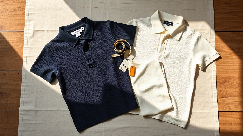
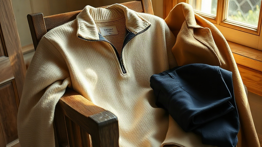
- Knit against woven: the clearest break. A ribbed polo or half-zip over tailored trousers reads well at any scale.
- Linen against wool or wool-blend: seasonal logic and material logic align neatly here.
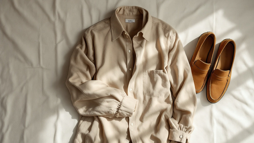
- Suede against cotton or linen: shoes and belt do the heavy lifting, no outerwear required.
- Matte against slight sheen: a silk-blend skirt under a matte cotton top, or a twill trouser under a knit top.
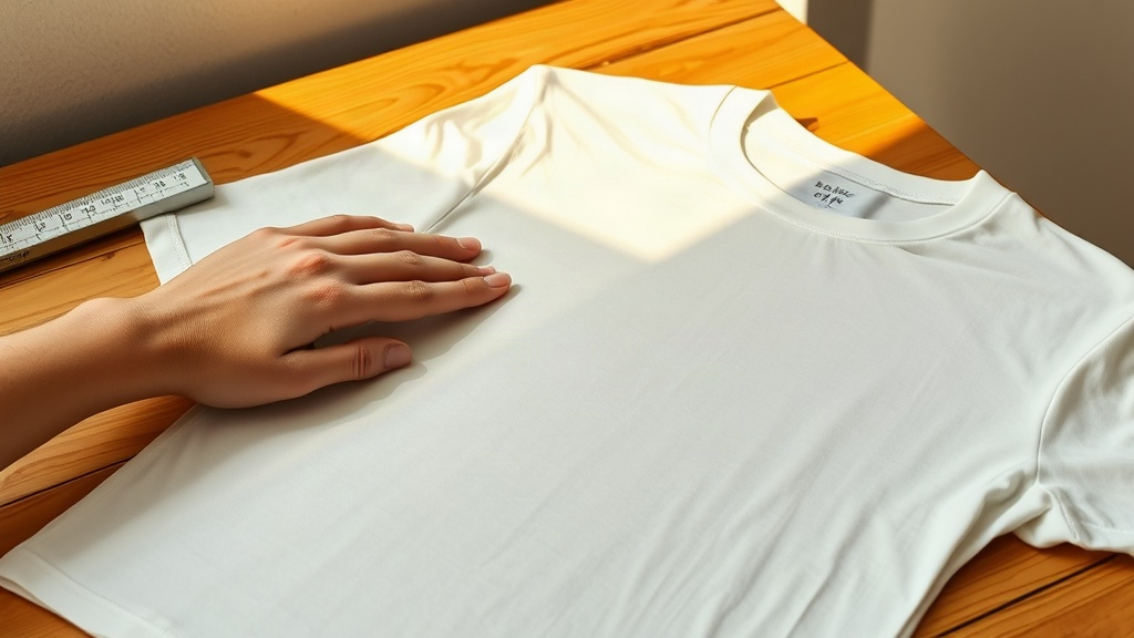
What does not work: two woven fabrics in similar weights. A beige Oxford shirt with a cream linen shirt as an underlayer, for instance. The textures are too close; the outcome is noise, not harmony. The same caution applies to lightweight jersey: cream jersey telegraphs too little surface variation to register as intentional texture. Choose a ribbed or waffle-weave alternative whenever the base fabric is cotton knit.
Proportion Logic: How to Anchor the Silhouette
A cream-and-beige outfit without clear proportion anchoring reads as a cloud. The solution: one element lighter, one element darker, and a clear break at the waist or hem line.
The classic approach places the lighter tone on top, a cream or ivory knit, and the warmer, deeper beige below. This follows the logic of most tailored wardrobes, where the upper body draws the eye and the lower half grounds the look. A camel-toned wide-leg trouser under a cream ribbed polo. An ivory linen shirt half-tucked into a warm sand-toned silk skirt.
The reverse, beige on top, cream below, is harder but possible. It requires a clean contrast in the bottom piece (near-white rather than soft cream) and a break at the shoe. A beige herringbone jacket over cream straight-leg trousers works when the trouser is genuinely pale and the shoe is a clear anchor: dark tan suede, or even a polished burgundy loafer that pulls the whole thing to earth.
One additional proportion note worth keeping: avoid equal lengths. When a cream top and a beige layer below share the same hem point, the eye loses its reference for where one piece ends and the other begins. A half-tuck, a cropped knit, or an open overshirt with a visible base all restore the vertical break the eye needs.

The Fabric Choices That Carry the Palette Best
Not every material flatters this palette. Some fabrics, in cream or beige, look immediately inexpensive. Others age into the color and look richer the more they are worn. Knowing the difference shapes every purchase decision.
Fabrics that carry cream and beige well:
- Linen: the natural cellulose fiber holds warm neutral dyes with depth. It wrinkles in a way that adds character rather than looking disheveled, and it works from spring through early autumn without visual contradiction.
- Wool and wool-blend: the lanolin in wool creates a subtle sheen that keeps cream from looking flat. Merino in cream is particularly forgiving; heavier woolens in camel or toffee beige carry the palette through winter.
- Cotton with a raised texture: piqué, ribbed knit, waffle weave. Plain cotton in cream or beige photographs and reads cheaply. Give it surface structure.
- Suede and full-grain leather: for shoes and belts, suede in tan, camel, or tobacco completes the palette without introducing a harsh contrast.
- Cashmere: in cream or oatmeal, a lightweight cashmere knit carries the palette with a warmth that merino approaches but does not quite replicate. At 2-ply, the drape softens the silhouette without losing definition at the shoulder.
Fabrics to approach with caution in this palette: synthetic-heavy blends (they reflect light unevenly and the color looks artificial), thin jersey (cream jersey telegraphs everything underneath), bright polyester satin marketed as ivory (the sheen is wrong, too sharp, too cold).
How Accessories and Shoes Complete, or Break, the Look
Footwear is often where a cream-and-beige outfit resolves or unravels. The shoe sits at the bottom of the frame; it either grounds the tonal register or introduces a dissonance that reads as careless rather than considered.
The clearest success: tan or camel suede loafers. They deepen the palette’s warmest note and provide a clean terminus for the silhouette. Dark brown leather is safe but slightly at odds with the softness of cream and beige. Black leather interrupts, it can work as a deliberate contrast, but it reads as a different outfit rather than a continuation of the tonal logic.
White sneakers in a cream-and-beige outfit flatten the whole register. The stark white sits against cream in a way that makes the cream look dirty rather than intentional. A bone or off-white canvas trainer is marginally better; a tan leather trainer or a minimalist suede sneaker in camel integrates more naturally.
For bags and small leather goods, warm tan, cognac, or tobacco are the safe registers. A structured bag in natural pebbled leather or a slouchy suede pouch in camel both work. Avoid bright gold hardware, it pulls the look toward occasion dressing when the outfit is fundamentally casual or smart-casual. Brushed antique brass hardware sits better against these tones.
A Comparison: Three Ways to Build the Combination
| Approach | Top / Layer | Bottom / Base | Shoe |
|---|---|---|---|
| Knit over tailored | Cream ribbed half-zip or polo | Camel wool-blend pleated trousers | Tan suede loafer |
| Linen layering | Ivory or ecru linen overshirt, worn open | Sand linen trousers | Tobacco leather loafer or espadrille |
| Silk and woven cotton | Cream or oat cotton shirt, lightly structured | Warm beige high-waist silk or crepe skirt | Bone or nude kitten heel, or tan mule |
When to Introduce a Third Tone
A cream-and-beige outfit is self-sufficient. A third tone, when it appears, should serve a structural purpose: grounding, punctuating, or providing the visual anchor that suede shoes cannot supply alone.
The most reliable third tones within this register:
- Camel or toffee: extends the warm palette deeper without shifting out of the register. Useful in outerwear, a camel coat over cream and beige beneath is a reference pairing for a reason.
- Warm charcoal or dark taupe: pulls the look toward autumn or winter dressing. A charcoal flannel trouser with a cream half-zip and a taupe overcoat works as a complete three-tone outfit that never breaks the tonal register.
- Olive or muted sage: the one slightly adjacent color that does not disturb cream and beige. An olive field jacket or overshirt over an ivory turtleneck and beige chino is a casual interpretation of the same logic.
- Burgundy: richer, more deliberate. Best kept to shoes or a belt rather than a major garment. A burgundy loafer is enough.
Colors to leave out: navy, black (as a major piece), any saturated tone, any bright white. These all work against the palette’s essential character rather than extending it.
“Elegance is refusal.”
Coco Chanel, as recorded in numerous conversations with Paul Morand, 1946
Tonal dressing, cream against beige, beige against camel, is precisely this: the refusal of contrast for contrast’s sake. The palette asks for commitment. It rewards patience.

Men’s and Women’s Versions of the Same Logic
The structural principles apply regardless of the wardrobe being built, but the specific garments differ enough to address separately.
For men, the cream-and-beige combination tends to work most cleanly through the classic knitwear-and-trouser framework. A cream cashmere or merino half-zip over camel wool-blend trousers is a winter iteration. In warmer months, an ivory linen shirt with sand linen trousers carries the same register at a lighter weight. The polo shirt in cream, worn over beige chinos, is the most casual expression of the pairing, it works from late spring through early autumn without effort. Explore the full range of refined polo shirts for men that anchor this tonal palette through every season.
For women, the silhouette opens more possibilities: the high-waist silk skirt in warm beige under a cream cotton shirt reads differently from the same cream-and-beige in wide-leg trousers and a fitted knit, but both operate on the same proportion logic. The cream-and-beige dress is its own category, a single garment that achieves the tonal effect through a colorblocked cut or a tonal print. The old money women’s collection covers both structured and fluid expressions of this palette, from tailored trousers to draped skirts.
Common Failures and How to Read Them
Most cream-and-beige outfits that do not work fall into one of three categories.
The first: tones too close. When cream and beige are separated by less than two or three clear steps in value, the outfit looks accidental rather than intentional. The fix is not to introduce a contrasting color, it is to reach for a truer cream (brighter, cooler) and a deeper beige (more sand, more camel). Standing in a dressing room under incandescent light makes this difference hard to judge; carry the two pieces to a window before deciding.
The second: flat surfaces. Two matte woven fabrics at similar weights create a visual monotony that reads as uninspired rather than restrained. At least one element needs surface texture. Ribbing, bouclé, waffle knit, brushed flannel, suede, any of these break the surface plane and restore the visual interest that color cannot provide.
The third: no anchor at the foot. A cream-and-beige outfit that extends all the way to a white sock or a pale canvas shoe floats without resolution. The eye has nowhere to land. Ground the look with a tan, tobacco, or camel shoe and the proportion clicks into place. A slim leather belt in cognac or dark tan performs the same grounding function at the waist. Browse the old money loafers collection for suede and leather options that resolve the palette from the ground up.
Building a Tonal Neutral Wardrobe Around This Palette
Cream and beige are not a single-outfit experiment. They are the foundation of a wardrobe strategy. Once the core principles are understood, tonal distance, texture contrast, proportion, grounding at the foot, the same logic scales across seasons and contexts.
A working tonal wardrobe in this register might include: two or three cream or ivory knits in different weights (a lightweight ribbed polo for summer, a mid-weight half-zip for autumn, a heavier roll-neck for winter), two pairs of trousers at different depths in the beige register (sand linen for warm months, camel wool-blend for cool months), one or two linen or cotton shirts in warm oat or ivory, and a camel overcoat as the outer layer that ties everything together without effort.
With those eight to ten pieces, the cream and beige tonal palette covers most casual and smart-casual occasions through the year. Each piece works with every other piece. The outfit decisions become smaller; the coherence of the wardrobe becomes larger. That, finally, is why the palette attracts the kind of dresser who has been at it long enough to stop performing and start wearing well. For a broader starting point across all wardrobe categories, the best sellers collection gathers the most returned-to pieces in these precise neutral registers.
FAQ
How do I wear cream and beige without looking washed out?+
The key is tonal distance and a grounded foot. Place the cream piece closest to the face, as its cooler reflectance lifts the complexion more reliably than warm beige does. Then push the beige toward a deeper camel or sand tone rather than letting it drift toward ecru. A tan or tobacco shoe at the base gives the eye a landing point. Without that anchor, even a well-proportioned outfit can read as pallid rather than polished.
Can you mix cream and beige without looking washed out?+
Yes, but only when there is clear tonal distance between the two pieces and at least one deliberate texture break. The outfit fails when cream and beige sit too close in value, they read as a single, shapeless tone. Push one piece toward near-white cream and the other toward a deeper camel-beige, and ground the look with a tan or tobacco shoe.
What is the difference between cream, ivory, and beige?+
Cream and ivory are both close to white, with cream carrying a very faint warm or neutral undertone and ivory sitting slightly yellower. Beige reads distinctly warmer, it pulls toward yellow and brown, closer to sand or undyed wool. In practice: cream and ivory behave similarly in an outfit; beige behaves as a true warm neutral and needs to be treated as the deeper anchor in a tonal pairing.
What colors work alongside cream and beige without breaking the register?+
Camel and toffee extend the palette naturally. Warm charcoal or dark taupe pull it toward autumn and winter without disrupting the tonal logic. Olive introduces a muted adjacent note that works in casual contexts. Burgundy, kept to shoes or a belt, is the richest accent that does not overwhelm. Navy, black, and any saturated color shift the outfit into a different register entirely.
What fabrics work best in cream and beige outfits?+
Linen, merino wool, cashmere, and textured cottons (ribbed knit, piqué, waffle weave) all carry cream and beige with depth and warmth. Suede in tan or camel is the right choice for footwear and small accessories. Plain synthetic fabrics in cream or beige tend to look flat or slightly off in color, the dye reacts differently than it does in natural fibers.
Does cream and beige work year-round?+
The palette is seasonal in its fabric choices but not in its color logic. In summer: linen shirts, silk skirts, cotton polos. In autumn and winter: wool-blend trousers, cashmere knits, suede footwear, and a camel overcoat as the outer layer. The tones themselves, cream against beige, work across all four seasons when the material weight is adjusted accordingly.
Shop the edit
Best Sellers
Timeless clothing and accessories, made to be worn for years.